The Waringo report on the internal management of the Grand Ducal Court of Luxembourg was presented to the public on 31 January 2020. One can learn from it that the Grand Ducal Court since 2001 has a communication service, that deals with the communication of the activities and news of the court, requests for information from the media, a daily press review, the supervision of the national and international media, and updating the two websites of the family. At the moment the team exists of three press officers and a webmaster. Jeannot Waringo, who created the report, means the collaboration between the palace and the Government Information and Media Service (SIP) should be reinforced.
He also had a look at the website(s) of the Grand Ducal Family. Currently there are two websites: Monarchie.lu and Grande-duchesse.lu. In recent years apparently priority has been given to the site of Grand Duchess Maria Teresa, which is managed by modern software, that makes it easy to manage the website. The software of the general website is no longer suited to the current needs and requirements. Waringos opinion is that the Luxembourg state should only fund the general website, and that the website should be updated as soon as possible and get a more modern and interesting presence. Unclear is if the IT-services and the communications service of the court are also responsible for the websites of the organisation StandSpeakRiseUp and the Fondation du Grand-Duc et de la Grande-Duchesse.
So let’s have a look at the websites of the family.
The Grand Ducal Family
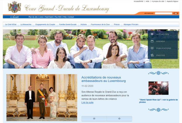
Old-fashioned design? Yes it has, although one at least can see all the content at first glance. It is probably one of the most old-fashioned websites of monarchical families and you just keep on clicking from one page to another to get the information you need. I wouldn’t have placed the menus for the sitemap, FAQ, content, accessibility, etc. on top of the site, but rather at the bottom. The main menu is: the Head of State, the Monarchy, Engagements of the couple, Grand-Ducal family, History, Court Suppliers, Media, Princely marriages. A site menu on the side of the main photo furthermore shows: news, agenda, publications, photos. More to the bottom another side menu shows the agenda of the family, a link to the space for media, links to Facebook and Twitter, and one to the Fondation du Grand-Duc et de la Grande-Duchesse. I think it should be sufficient to place the information in “Espace Presse” under “Contact”.
The front page, with a great family photo on top, is quite OK to me. I only think the press announcements take up too much space, and they should not be the main feature on the site. As soon as you click on the menu you are entering a totally different and outdated site, that dates from at least 2011 and looks incredibly dull. I can’t remember when the site was first launched, but that must have been some time before that. I suggest to make a completely new design and they should have a look at the sites of several other monarchies to see how the family could be presented much better than they are now. All the necessary information is there I think, as I always find what I need, but not presented in a very interesting way at all.
The “chef de l’Etat” information is rather boring, telling about the function of the Grand Duke. This could easily be integrated in the information about Grand Duke Henri himself, or in a FAQ part. The same counts for some information in the “monarchie” section and the “fournisseurs de la cour” item (why does that have a place in the main menu at all?). The Dutch royals for example have listed these kind of items under “Themes”, and certainly not as the first info on the site. The “activités du Couple grand-ducal” don’t need to be mentioned seperately, and could be part of the agenda. Surprisingly the item that might interest people most, “Famille grand-ducale” is only the fourth item on the menu list. There is some general information, before one finally gets links to the various family members, with biographies in French, with an English and German PDF-version at the bottom. “Histoire” could be rather interesting, but not the way it is shown now. “Mariage Princier” has links to information about the weddings of Hereditary Grand Duke Guillaume and Hereditary Grand Duchess Stéphanie in 2012, and Prince Félix and Princess Claire in 2013. Very nice reports if you keep on clicking on the links, but since the weddings were quite a while ago, one wonders why they still have such a prominent place.
“Actualités” and also “Agenda” could be presented so much better on the front page of the site as that is information, most people are actually looking for. Although again presented in a rather old-fashioned way, I do like the photo galleries a lot. Evénement pictures don’t need a separate space if you use them under “actualité”. A nice addition, that I don’t think is available on other royalty sites, can be found under “Publications”. Badly presented again, it highlights publications about the family in various languages, for anyone who would like to read more about them. Too bad that some of the links don’t work anymore.
It is a pity that a website that attracts visitors from all over the world is mainly in French. Especially as also German and Luxembourgish are official languages in the country. Also press announcements are only being sent in French, even when there is lots of media in the other languages too. I would at least also suggest an English version for the international visitors, who often won’t speak any of the official languages in Luxembourg.
Grand Duchess Maria Teresa
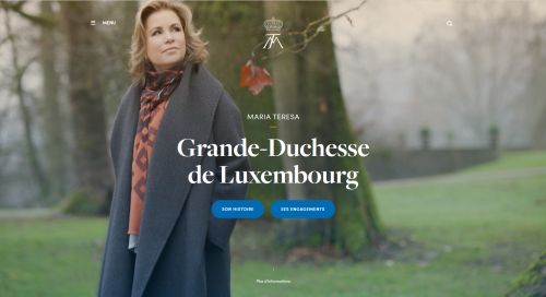
One can wonder why Grand Duchess Maria Teresa has her own website at all, especially since she is not the head of state and the website of her initiative “StandSpeakRiseUp” should be sufficient. All her activities and interests could easily be integrated into the new grand-ducal website.
That said, the look of the website of the Grand Duchess is much more modern than the one of the family itself. The design is very fitting for a personal website. There are lots of beautiful photos of her and her activities. The site’s focus is on her, her engagements and passions. It also contains photos and videos. Really the only thing I don’t like, again, is that the site is only in French, and the audience thus is very limited.
The Grand Ducal Family on social media
The family makes use of social media and have several accounts. They are all updated regularly, and recently they have surprised people by sharing old photos. I am just not a big fan of the small photo on Twitter that doesn’t look well together with the coat of arms on a white background. I am certain they could design that much better – more like the Facebook one – and it wouldn’t cost much work. The Twitter account exists since September 2010, Facebook since October 2010. Instagram was launched in October 2017. Surprisingly the link is still not given at the official website.
Château les Crostes
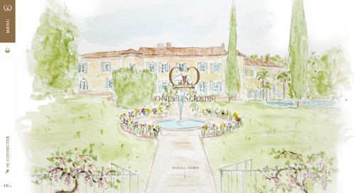
The vineyard Château les Crostes of Prince Félix and Princess Claire in the south of France, as a business, of course has its own website. Modern design, romantic, interactive, and the information is given in French, German and English. The site has all that is needed and looks good too. They only should make the logo of “Le Sourire de Lucie” work at the bottom, below the social media icons, in the German and English version.
Tessy Antony-de Nassau
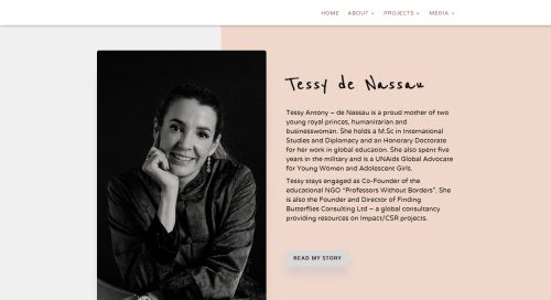
The former wife of Prince Louis of Luxembourg, Tessy Antony-de Nassau in 2019 introduced her own website, simple but efficient. It is regularly updated and gives information about her and her work, as well as her agenda. Also her projects are all shown, there is a blog with news, videos and a gallery with photos. Furthermore she is on social media.


